Mobile email opens, which include both smartphones and tablets, accounted for 67.78 percent of all opens, according to Movable Ink’s Q2 2015 U.S. Consumer Device Report.
That means more than two-thirds of email recipients are opening their emails on a mobile device rather than a desktop or laptop.
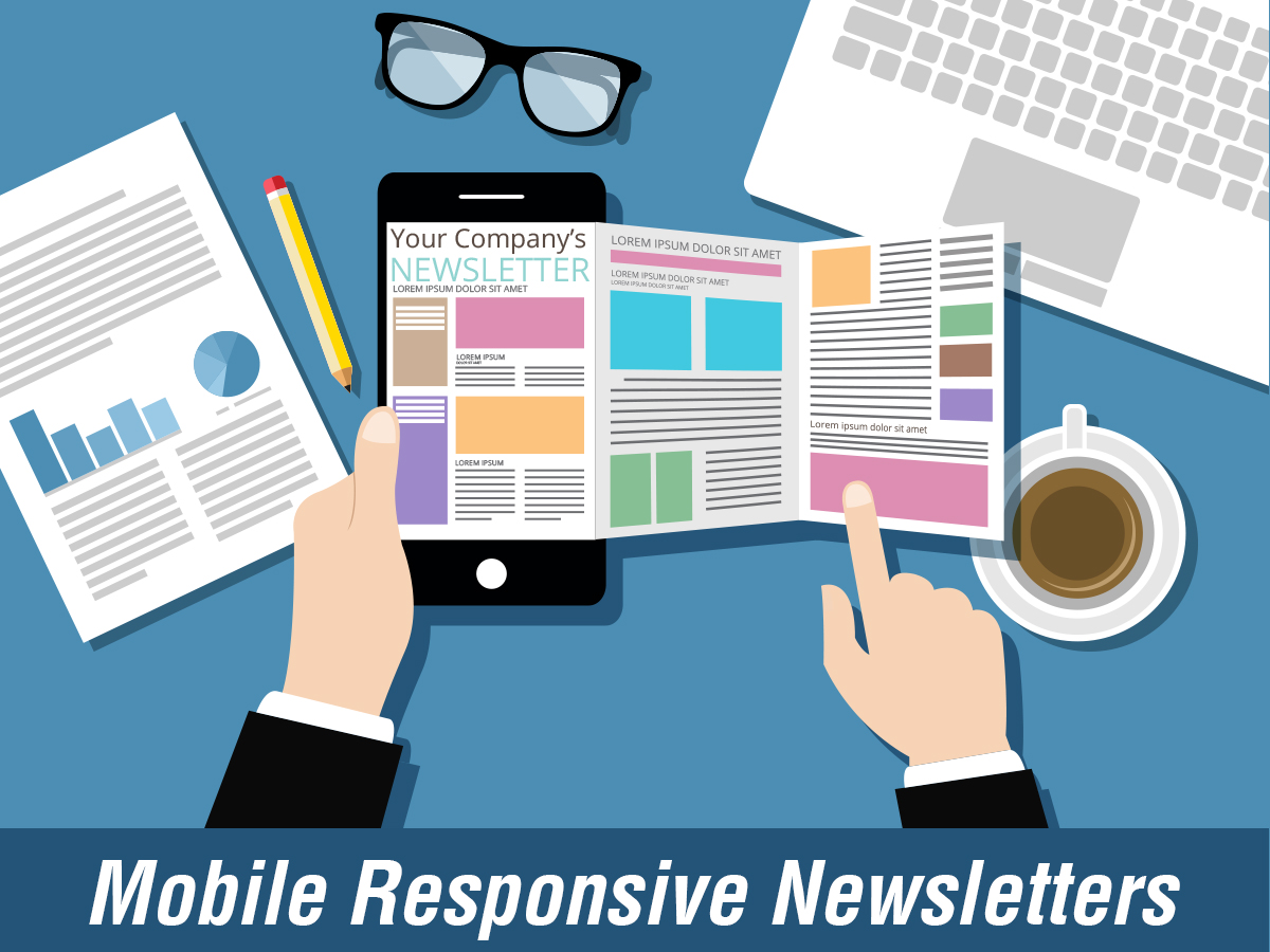
But what if your email newsletters are not designed to respond to the specifications of mobile devices and the behaviors of on-the-go users? Are you forfeiting potential business because your emails are not mobile-responsive?
The short answer is yes. But let’s take a look at the how and why.
Mobile Device Screens
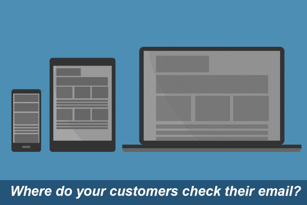
If you think about it, the screen of a smartphone or tablet is not the same size as a desktop or laptop computer. Far from it.
Naturally, the amount of information that can be displayed on a mobile device is much less than on a computer you would use at home or the office. Therefore, the way information is displayed on a mobile device needs to be formatted differently than it is for a desktop or laptop screen.
For example, many old-school email newsletters are formatted with the important content positioned in the main column with secondary information in the sidebar. These legacy formats are tricky to display on mobile devices and often result in random boxes of information and images that are not aligned with the right content.
If you want to make it easy for readers to digest your content and take action, you want big, bold images and large, easy-to-read fonts, links that are big enough to click without zooming, and calls-to-action that are visible without having to scroll.
To help with this, mobile-friendly email newsletters can take a note from responsive website design, which frequently employs “scroll-down” formatting, including the most important information at the top and prominent buttons and links throughout.
Mobile User Behaviors
Inherently, mobile users are on-the-go consumers looking for highly relevant information…and fast. If your email newsletters do not address the “need to know now” preferences of smartphone and tablet users, then you could be losing out to competitors who are invested in mobile-friendly communications.
For example, did you know that more than 90 percent of consumers aged 18 to 43 years old used their smartphones while shopping in stores? 1 That means you may need to consider the context and timing of your email newsletters.
Do most shoppers in your vertical visit brick-and-mortar stores on the weekends? Are you displaying the nearest locations in your email newsletters, so that shoppers know how close your store is to their geographic location? Is it easy for shoppers to call you directly from your email newsletter? If you make it simple for consumers to get to you through your email newsletters, then you make it simple to do business with you in general.
Next Steps with Mobile-friendly Email Newsletters
When considering email newsletters for mobile devices and users, it is important to recognize that it’s not only the device that matters but also the type of consumer you are targeting.
The design of an email newsletter should make the reader’s journey seamless and pain-free, while the content should make it very clear what you want the reader to do before they even have to scroll (although compelling enough to make them want to).
In short, if your email newsletters are not mobile-friendly, then they need to be. If not for the sheer volume of opens you could be missing out on right now, then the for the obvious business you most certainly will miss out on in the not-so-distant future.
1Source: eMarketer “Smartphones Are In-Store Shopping Companions” http://bit.ly/SeiOMM